Turn window shoppers into clients! Learn how to craft a clever photographer contact page to earn more inquiries and book more sessions.
This ain’t your grandma’s photography business.
Who remembers business cards?
I remember business cards. I also remember the hundreds of (honestly, terribly-designed) cards I left all over my hometown as a teenage photographer, hoping someone—anyone–would call.
I don’t think I booked a single client everrrr from one of those cards.
What did help me book clients? My social network; my WPJA membership; and my website.
It’s a website wonderland.
Photographer websites are freaking phenomenal, these days. We’re talking gorgeous designs, beautiful logos, smart copy…
But over and over again, photographers overlook their website’s pivotal element:
The contact form.
Most photography contact pages are just… blah.
“Name. Email. Message.” That’s all we say to our clients at that critical moment of outreach. Name. Email. Message.
Don’t make this mistake. Make your contact form count! Here’s how…

Jules Photography
Fact: contact forms are premium real estate.
Your contact page is the first stop for customers who love with your work and want to give you money! It should motivate visitors to reach out to you. It should make them want to connect.
This is why you need the CaRV Rule, a game-changing approach that will finally make your contact page the marketing tool it should be.
CaRV: Care, Reveal, Value
Your brand should carve a you-shaped niche in the photography marketplace. That color, voice, and energy should flow throughout your website—including your contact info page where visitors come to connect.
What is CaRV?
The CaRV method:
- enables you to actively Care for your visitor
- Reveals your brand personality to your visitor
- makes your visitor feel Valued

Carrie Swails
How to show Care with your contact form
Care-driven content enables you to actively provide quality care for your site visitors. The answers to Care-based questions tell you what your visitor needs from you.
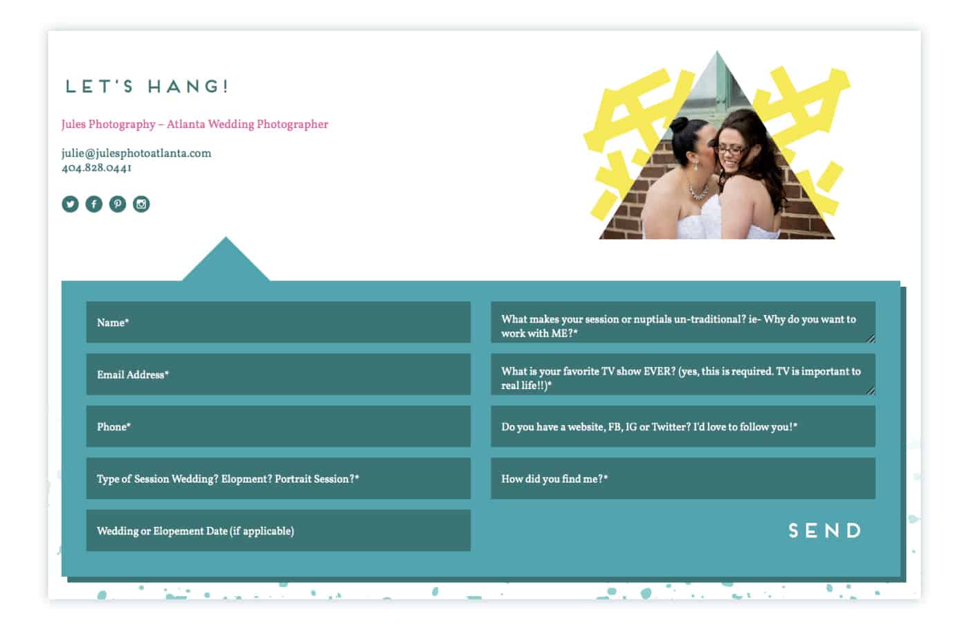
Jules Photography’s contact form works by making even the most basic questions FUN. She gets the details she needs in a colorful space that flows seamlessly into the rest of her photography website’s design.
Jules Photography
Jules’ contact page helps her screen for clients who understand her style. She asks one unexpected question that almost immediately tells her a ton about the potential client:
“What is your favorite TV show EVER?”
“Recently, a bride answered with, ‘Dr. Who!'” says Jules, “and I was like, WE’RE KINDRED SPIRITS! Then I learned she’d recently gone skydiving, and I knew we were meant to be. Weird questions can tell you a lot about someone!”
Because Jules’ ideal clientele celebrates in eccentric ways, it’s important to her to understand what makes them unique from the moment they contact her. Their responses on her contact page help her provide the best Care possible, from customizing coverage, to creating client gifts, to cultivating authentic relationships.

Jules Photography
How to Reveal with the contact page for your photography site
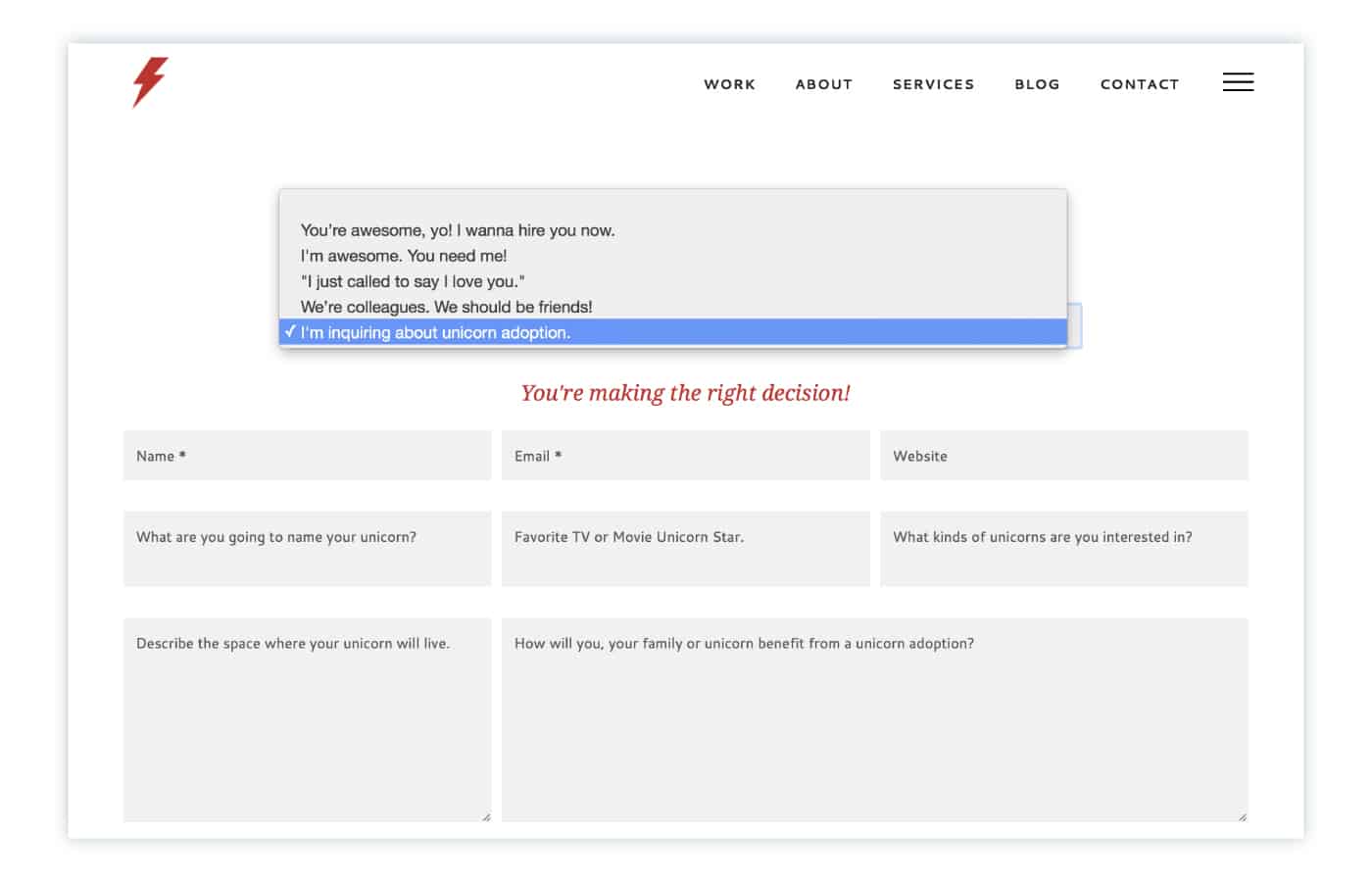
Design team Braizen understands that Care is more than sentimentality. Their brand voice is cheeky and daring. You’ll either connect with Braizen’s sarcastic humor or you won’t. Either way, everyone will know if it’s a good match once the contact form is complete!
In boldly looking for uncommon ways to Care for customers, Braizen Reveals their delightful brand personality and delivers a quirky connection experience.
Braizen
The way a visitor completes Braizen’s contact form also Reveals a lot about the visitor:
- sense of humor
- tolerance for sarcasm
- desire to “just get the job done” and bypass pesky get-to-know-you chats
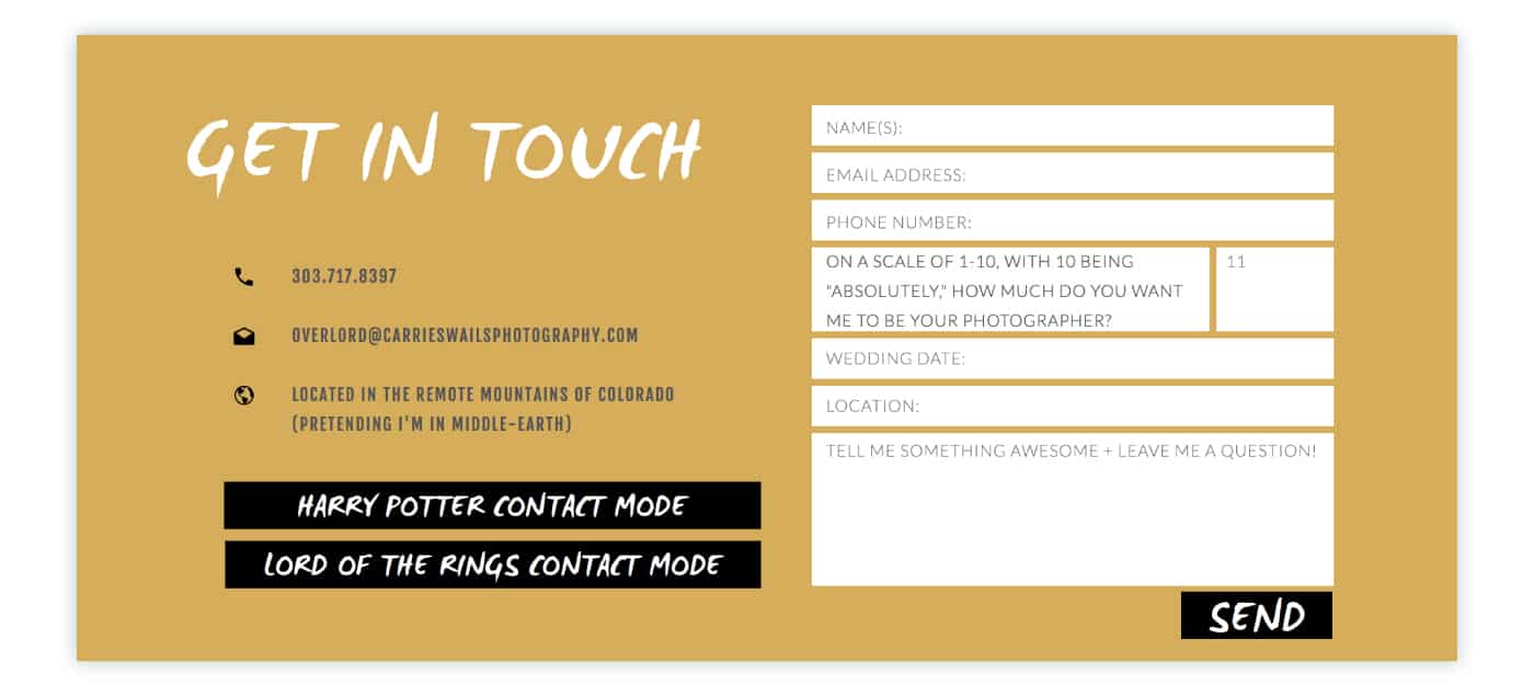
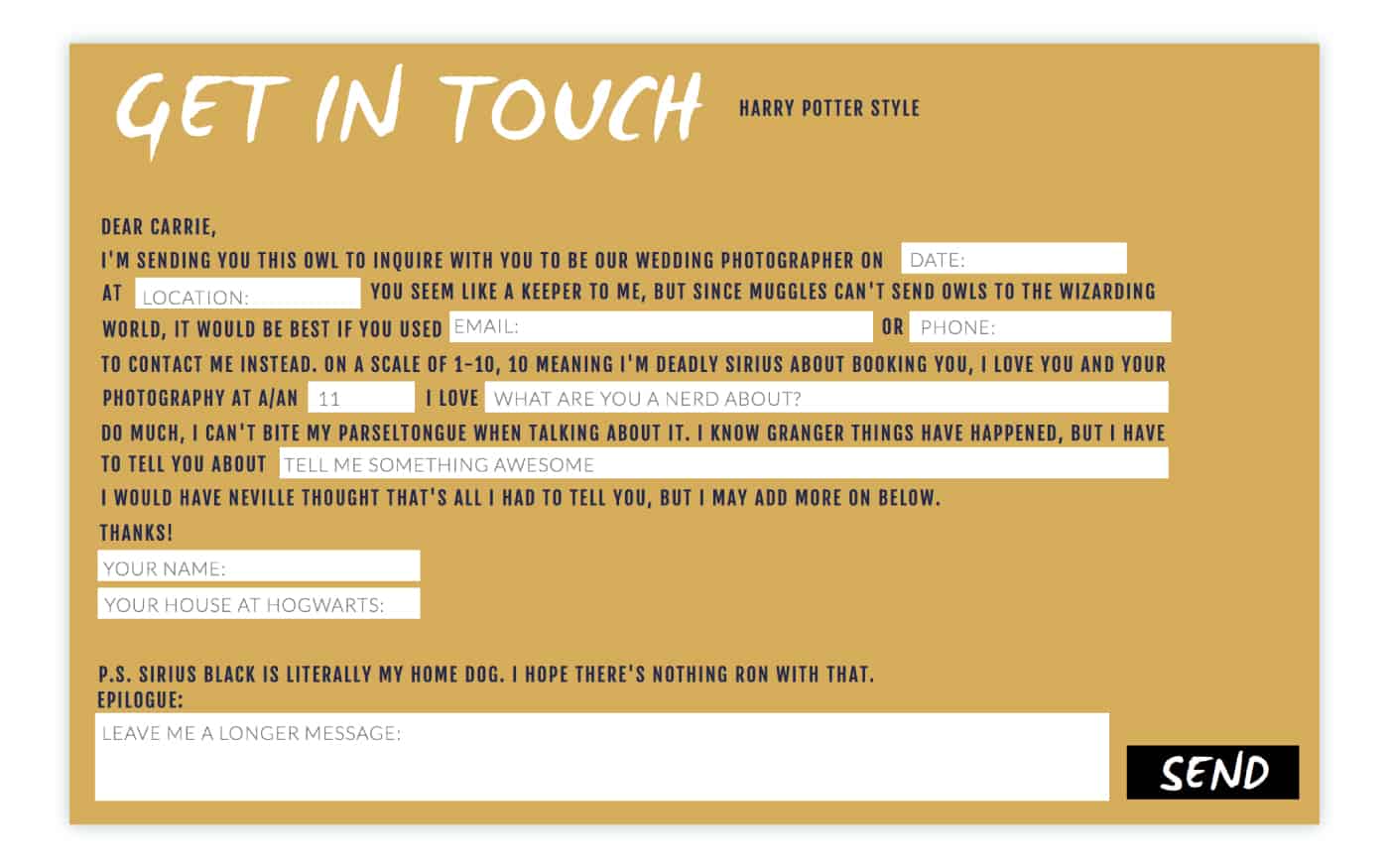
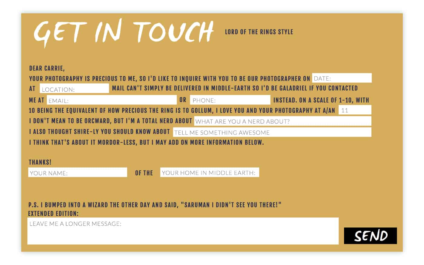
Self-proclaimed “nerdtographer” Carrie Swails’s contact page Reveals her personality so completely, like-minded visitors are hooked by the time they reach out. Her brand’s personality explodes off the screen, and visitors fall head-over-feet upon arrival.
Carrie Swails
Carrie Swails
Carrie Swails
Carrie’s mad-lib, choose-your-own-adventure form guide each visitor through a story-experience.
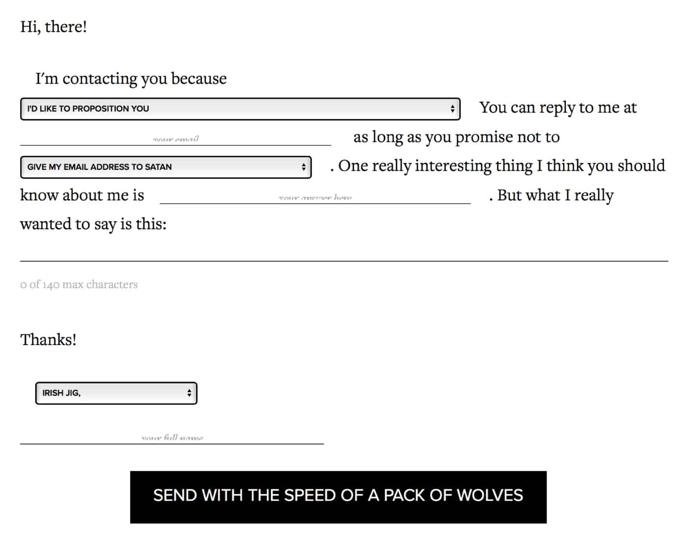
Ash, from The Middle Finger Project, chooses the same approach, inviting visitors to join her brash, irreverent banter. The Middle Finger Project’s polarizing brand-personality thrives precisely because it isn’t trying to be everything to everyone.
The Middle Finger Project
If you’re worried that your brand personality may be too big for some people: too silly, too sappy, too sarcastic, too sensational—you’re right. It will be. That’s the point.
You can’t be everyone’s photographer, and not everyone can be your client. Embrace the opportunity to Reveal yourself clearly and attract your ideal client.
How to demonstrate Value
Yes, even with a simple contact form, you can prove to customers that you Value them and want to provide Value to them. When a client feels Valued, they know you are genuinely interested in who they are and what they need.
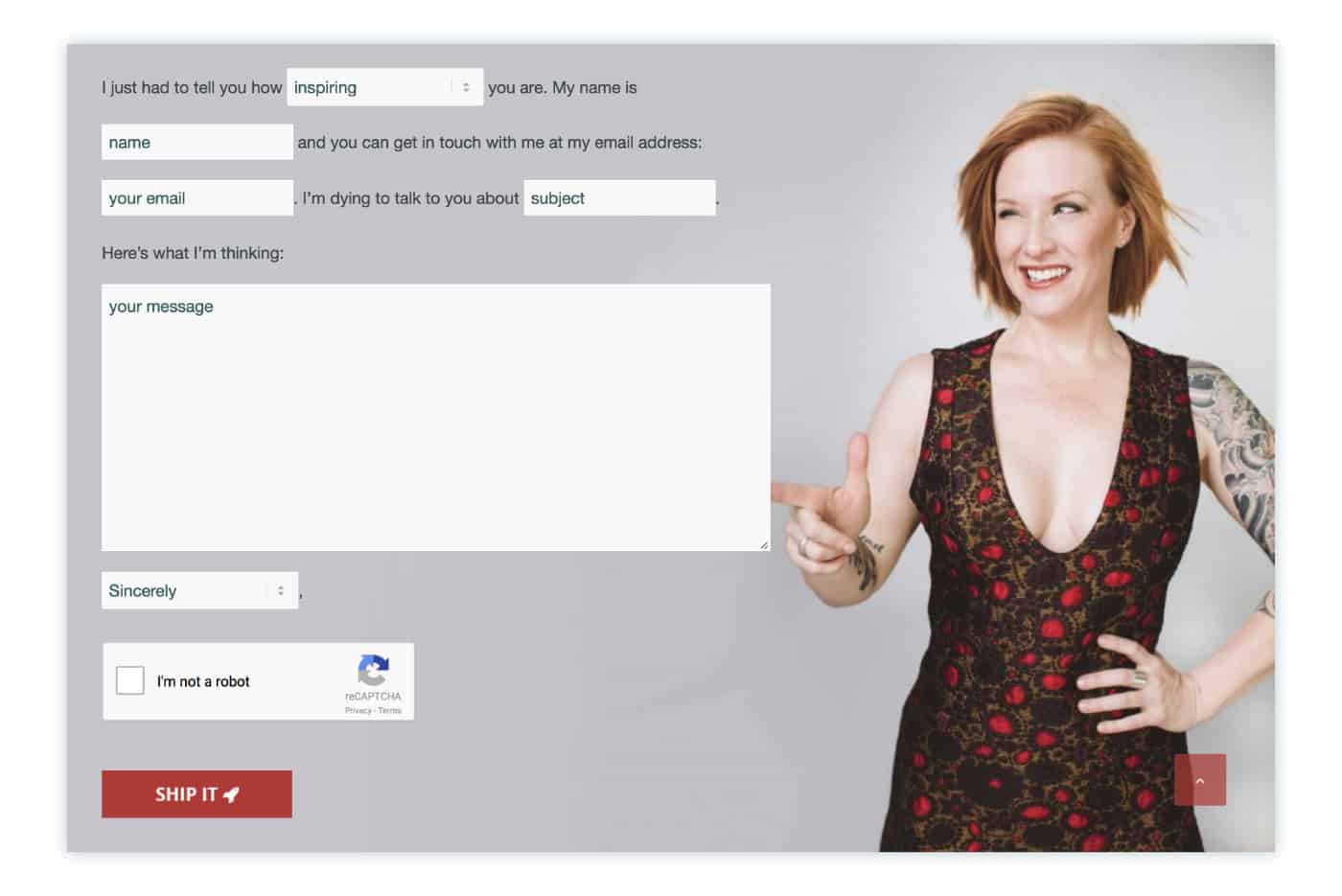
Actor Erika Napoletano collects contact information in a simply yet creatively, and includes plenty of space for her visitors to deliver a personal message. Filling out her contact page feels like an interaction with Erika herself!
Erika Napoletano
#ShootProofPRO Tip: Show your visitors who they’re talking to!
Erika understands the appeal of a friendly face. If you look like someone they’d like to work with, a customer is more likely to reach out to you. (If you don’t have any share-worthy photographs of yourself, remedy that ASAP. You’re a photographer, for crying out loud!)
TLDR: How to Care, Reveal, and Value
Clever, cute, quirky contact pages are awesome—but to fully implement the CaRV metho, you need to master the basics, too!
Make your contact info easy to find
Don’t bury your phone number and email address in your About page. Make it easy for folks to reach you. You may even want to include those two details in your website’s footer (along with your social media links) so the info is visible on every page of your site.
Respect your customer’s contact preferences
Ask how your website visitor would like to be contacted: email, phone, text, carrier pigeon… And don’t treat your contact form like sneaky signup form for your email list. Just because someone contacts you doesn’t mean they want your weekly newsletter.
Make it fun!
Most website builders offer a few built-in options for developing a customized contact page. Explore the possibilities, and choose one that resonates with your brand personality—and the personalities of the clients you hope to book!
Don’t forget who’s who
If you’re using a studio management platform like Táve or Honeybook, your contact form can auto-create a contact card in your CRM. This will empower you to track each customer’s needs over the course of your working relationship.

Carrie Swails
Now: start connecting!
Speak directly to your target market with every word and every photograph on every page. Care for, Reveal to, and Value your visitors with inspiration from some of the coolest contact pages ever made. And don’t hesitate to let your one-of-a-kind light shine!
Written by ANNE SIMONE | Featuring JULES PHOTOGRAPHY, BRAIZEN, CARRIE SWAILS, THE MIDDLE FINGER PROJECT, and ERIKA NAPOLETANO


