How To Make A Photography Website Your Dream Clients Can’t Resist

You want a photography website your dream clients will drool over. Explore the key ingredients of a winning website – then make your own! (Interview with designer MELISSA LOVE. Photographs by LISA DEVLIN.)
You have a solo-preneur budget, but you need a million dollar photography website.
In your visually-driven profession, you can’t simply post a one-pager with your phone number listed and call it a day. A brilliantly-built photography website will sell you as surely as your talent.
Is it possible to create a photography website with high-end appeal, without a high-end price tag?

Photo by LISA DEVLIN
To find out, I contacted brand builder and website designer Melissa Love, founder of The Design Space, and asked her:
“What are the key ingredients of a winning photography website?”
Keep reading to see Melissa’s answers, along with:
- stunning visual examples,
- detailed client connection advice,
- and a fresh, empowering take on creating your own incredible website.
Photo by LISA DEVLIN
A Super-Clickable Homepage
Case Study: LISA DEVLIN – devlinphotos.co.uk
My first introduction to Melissa’s work was through ShootProof pro Lisa Devlin‘s stunning website, so I was thrilled to see Melissa reference it as a prime example of website awesomeness.
MELISSA: Lisa Devlin’s photography website is a masterclass in how to use an authentic, playful voice without sacrificing professionalism or clarity. Simple navigation and an editorial feel allow Lisa to add fun hidden touches, while a mix of video and blog posts keep her homepage looking fresh.
Take a look…
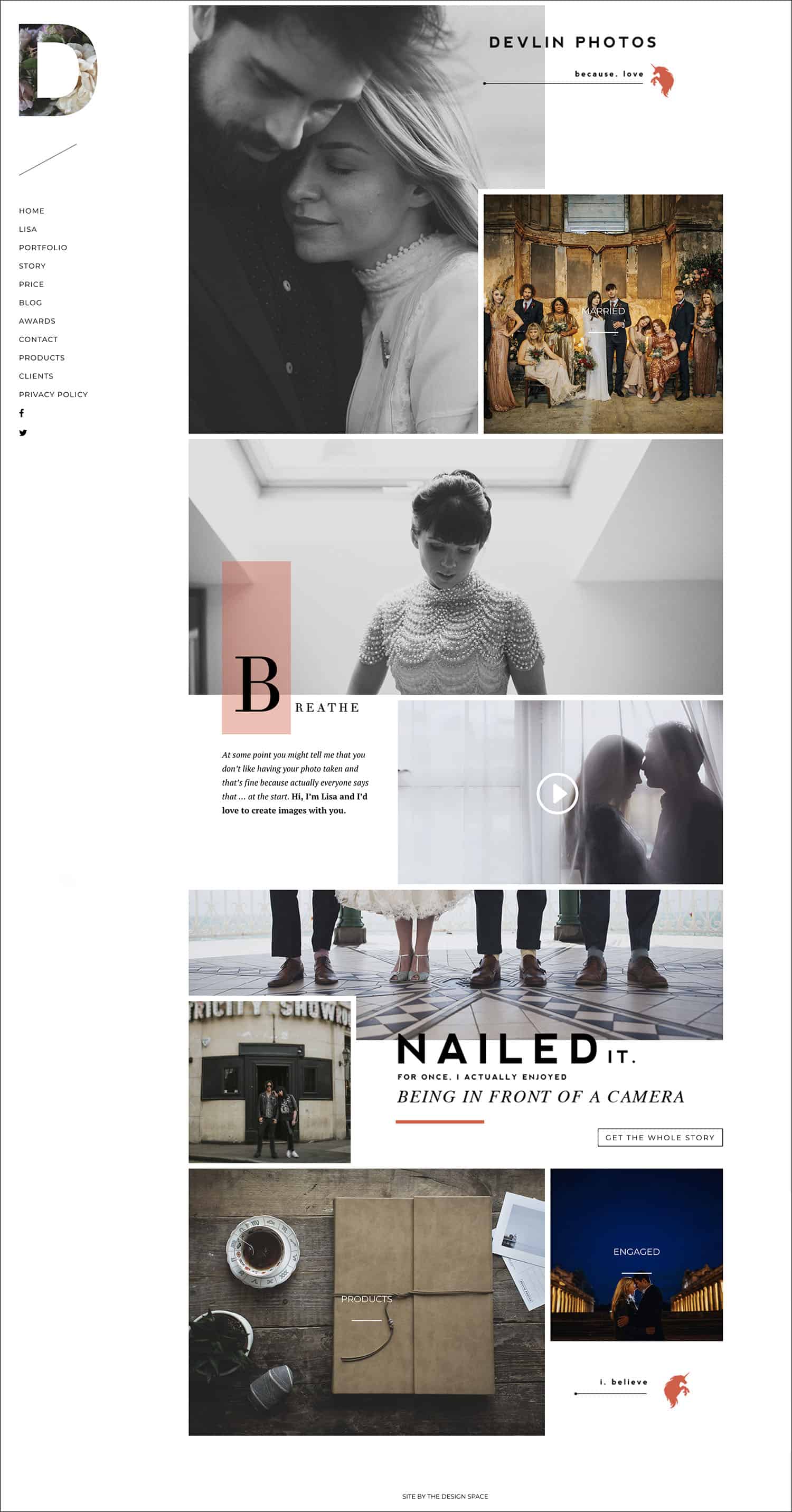
Lisa Devlin’s homepage at DEVLINPHOTOS.CO.UK
“Your homepage has one job: to get your visitors to click just once to further explore your website.”
– Melissa Love
Photo by LISA DEVLIN
What Makes Lisa’s Website So Engaging?
Lisa’s photography website wins big in six important ways – and that’s on her homepage alone! Melissa pinpoints the elements every photographer can implement:
#1: Lisa Keeps Her Homepage Updated
By feeding featured blog posts through to her website’s homepage, Lisa enjoys an easy, effortless way of keep new content front and center.
#2: She Incorporates Stills, Text, & Video
You don’t have to be a filmmaker to put some motion in the mix. Even a simple welcome video can add personality to your brand, and further connect you to potential clients.
#3: She Directly Addresses Common Client Concerns
Check out the Breathe section on Lisa’s homepage. With one simple statement, Lisa provides reassurance to folks who may feel uncertain about hiring a photographer.

Photos by LISA DEVLIN
#4: Her Homepage Sets Instant Expectations
Lisa’s homepage showcases the Queensberry albums she sells to nearly every client. This early awareness ties Lisa’s photography to product in a way that maintains her album sales near 100%.
#5: She Invites Her Clients Into the Photography Experience
Lisa links directly to her Story from her homepage. By telling potential clients what they can expect from a photography experience with her, she eases any worries and gets them excited to proceed with booking.
#6: She’s Playful
Professionalism is important; but you can’t be all business all the time. Lisa slyly reveals her cheeky side with a small surprise hidden within her photography website. **Can you find it?
**Hint: Follow the unicorns!

Photo by LISA DEVLIN
Make Mapmaking Your New Side-Gig
If Lisa’s website inspires you to reinvent your own, you’ll want to begin by surveying your client landscape.
Imagine your website is a big, colorful roadmap, and your dream client is in a tiny car chugging along its highways and intersections.
- Where does your client stop?
- What attractions inspire them to pull over?
- Do they travel light, or in luxury?
- Are they speeding down the highways, or meandering along back roads?
These answers will help you populate a homepage your dream clients will want to visit.

Photos by LISA DEVLIN
MELISSA: Once you can clearly visualize your ideal client, give yourself permission to speak to them in your own voice. Describe them and their ideal day or shoot, and highlight the values you are likely to share. It is particularly important to do this on your homepage.
Why is the homepage such a big deal? Because it’s your clients’ first stop. It’s your first impression.
Plenty of Personality
Case Study: HANNAH WEBSTER – lifelinephotography.co.uk
Playing it safe feels, well… safe. When your livelihood is on the line, it’s easy to worry that you’ll say too much or be too bold. We all worry that we’ll scare away a client we really want – or even need.
The truth, however, is that the only way to truly connect with others is to be vulnerable and real.

Photos by LISA DEVLIN
No, you don’t have to blog about your breakup or that time you got a ticket for driving with your Labradoodle in your lap. But Melissa does suggest that you find ways to share who you are. This will encourage potential clients to share their own stories in return.
MELISSA: If you don’t tell potential clients what you stand for and what you believe in, they are less likely to want to get to know you. Being clear about what you stand for is more likely to attract your ideal client. One photographer who does this brilliantly is Hannah Webster with Lifeline Photography.
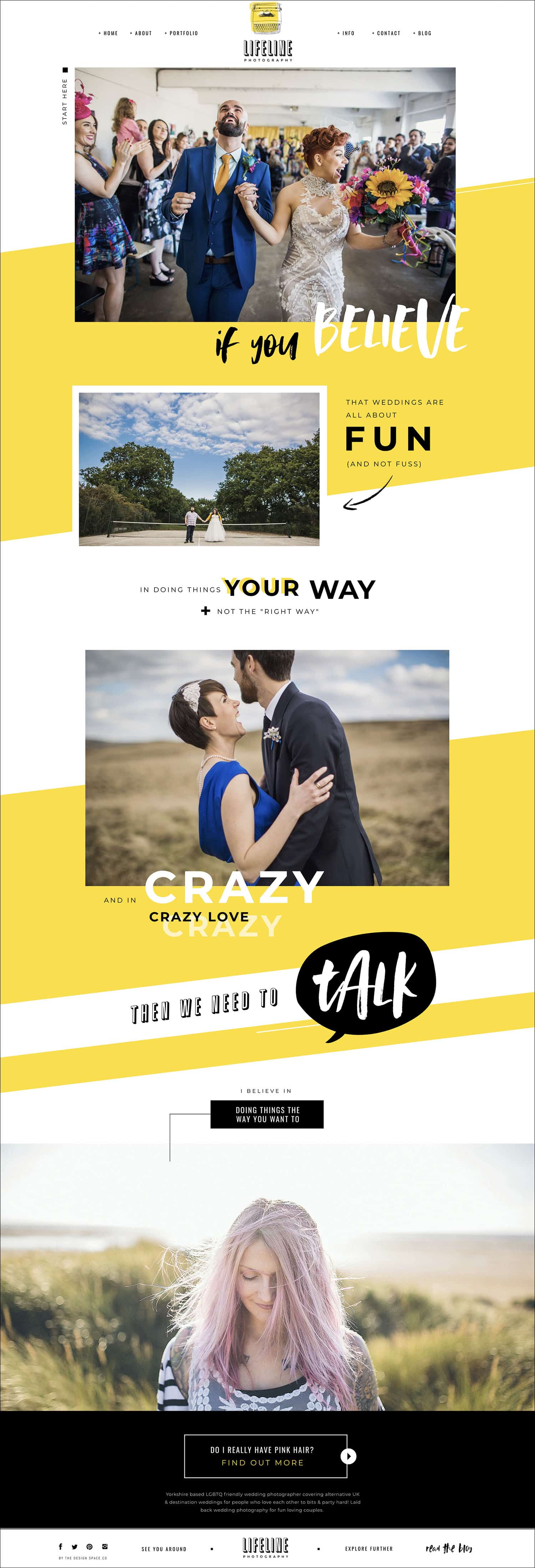
Hannah Webster’s homepage at LIFELINEPHOTOGRAPHY.CO.UK
Hannah is unabashedly herself. She even includes a self-portrait on her homepage. And just above her portrait? A rotating “I believe in…” field auto-populates with a fresh message every few seconds:
“I believe in walking off your worries… …in creative swearing… …in the restorative powers of a crisp sandwich…”
Anyone who’s fallen for Hannah’s photography can now fall for Hannah herself. And that’s precisely the kind of spark every photographer wants to ignite.

Photos by LISA DEVLIN
Text That Triggers BIG Emotion
Case Study: NADIA MELI – nadiameli.com
MELISSA: I love Nadia Meli; particularly the way her homepage copy speaks directly to her ideal client.
This “homepage copy” is the impactful, poetic statement Nadia shares in the very center of her photography website’s homepage. To call it a sales pitch would be crass, and it’s more than a description of services. It’s certainly not a bio.
What it is is revealing. What it does is draw like-minded clients – Nadia’s dream clients.
See how she does it…
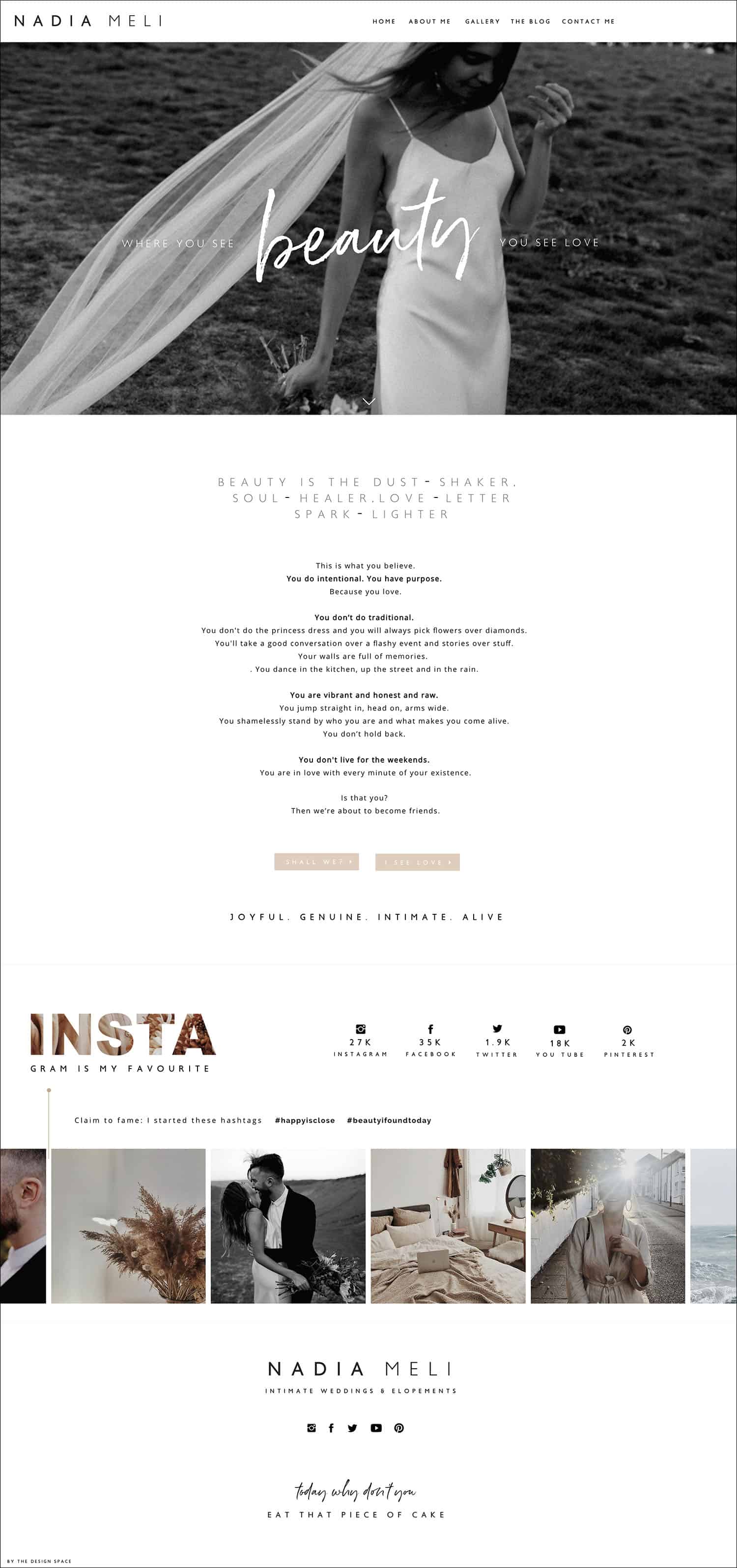
Nadia Meli’s homepage at NADIAMELI.COM
PRO TIP: Copy Vs. Content
Remember: “copy” is just a fancy word for text – sort of. You can learn more about copy and content here or here. A good rule of thumb is this:
Copy = text written explicitly to advertise or market something.Content = text and visuals crafted to engage or educate your audience.
This blog post is content. The ad or post that got you to read it? That’s copy.

Photo by LISA DEVLIN
Words That Look Lovely
Case Studies: CLAIRE MORRIS – clairemorrisphotography.com& DONAL DOHERTY – donaldoherty.com
There’s no way around it: you need words on your website. Words impart critical information to potential clients, and make your website discoverable by search engines. But when when folks are looking for photography, they’re unlikely to stick around for a website full of Helvetica.
“It’s important to aim for visually compelling copy throughout your website. Try breaking your copy into small, digestible chunks, and look for ways to divide the page itself into themed sections.”
– Melissa Love
Claire Morris’ photography website is a terrific example of how illustrations, shapes, and pull quotes can make your text visually appealing.
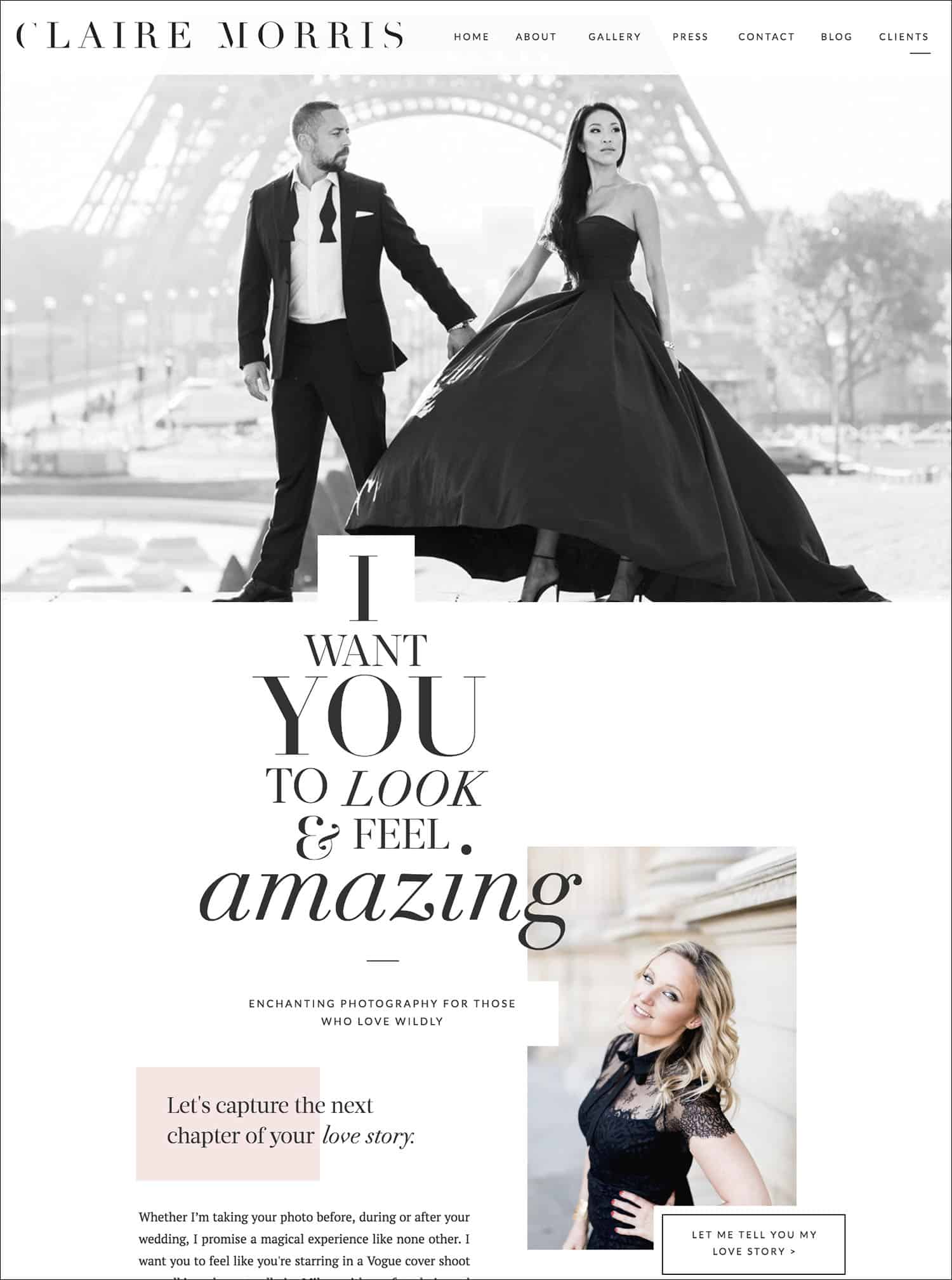
Claire Morris’ homepage at CLAIREMORRISPHOTOGRAPHY.COM
Instead of leaving your text to stand alone, let it mingle with your imagery. Donal Doherty does this by overlaying his video clips with text, turning static information into a eye-catching mini-movies.
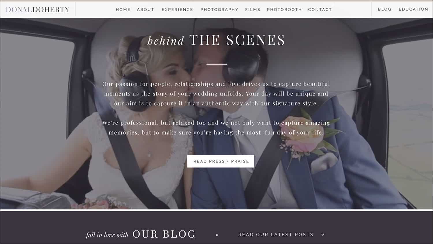
A page from Donal Doherty’s website at DONALDOHERTY.COM
A Clear (& Clever) Call To Action
Case Study: ANDREA ELLISON – andreaellison.co.uk
The call to action is the part where you finally indicate to your website visitor: Hey! I want you to do THIS now.
A call to action can be as obvious as Email Me, or as enticing as Andrea Ellison’s prompt, Follow Me To the Sea, which you’ll find at the bottom of her homepage:
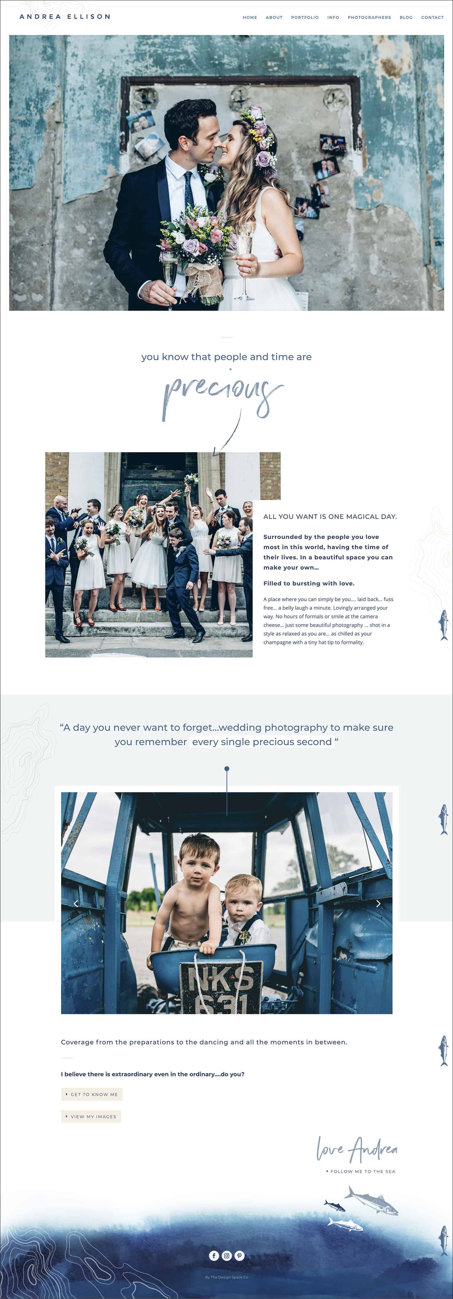
Andrea Ellison’s homepage at ANDREAELLISON.CO.UK
“Photographers tend to have very few calls to action on their websites, because they’re afraid of being too ‘salesy.’ However, a call to action can be subtle. Some of the best calls to action lead the eye along a pre-determined path and deeper into the photography website.”
– Melissa Love
Andrea uses conversational prompts to draw her website visitors down her homepage, then lead them through her images and messaging. At the end of this short journey, they find her calls to action.
The website visitor feels totally in control, but Andrea has guided them to the options she wants them to see first.
Photos by LISA DEVLIN
PRO TIP: Create Your Own Call To Action Path
Want to implement Andrea’s approach on your own website? Think conversationally! How would you segue from topic-to-topic in a real-life conversation? Use those same skills to pull your website visitors through your homepage story.
Get Creative with Your Contact Form
A great call to action path doesn’t stop with your homepage. Claire Morris’ contact page engages visitors with personal, interactive fields. These lead neatly to the final action button: Send the Message.
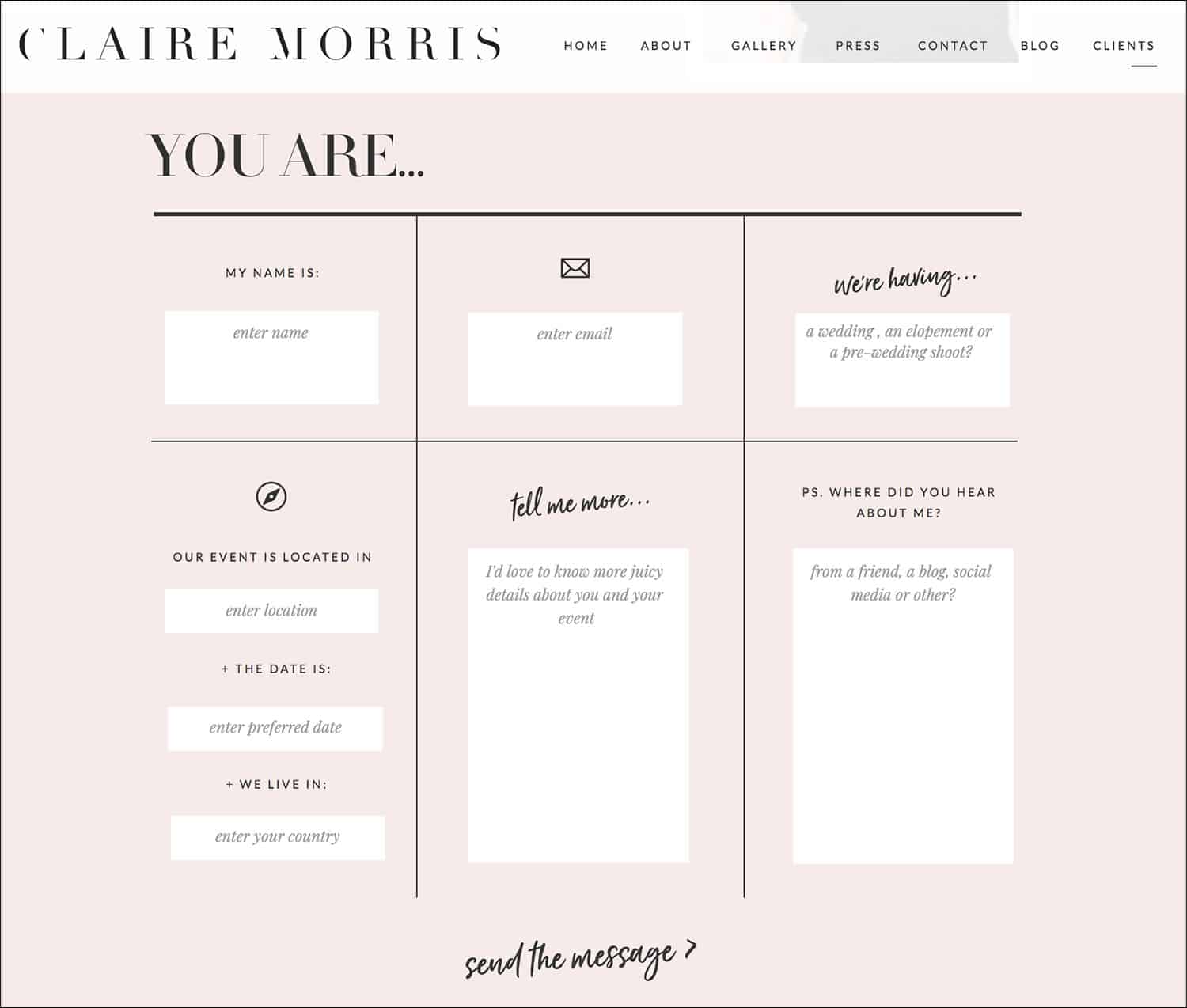
Claire Morris’ contact form at CLAIREMORRISPHOTOGRAPHY.COM/CONTACT
Your contact form may be the final page a potential client sees before leaving your website. Don’t let it be the boring.
Find more contact form ideas HERE!
Must Be: Mobile-Friendly
We all love our smartphones and tablets. In fact, we love them so much that in 2017, Google began prioritizing search results based on websites’ mobile performance.
As Melissa explains, this means your website receives a lower Google search ranking just for being mobile-UNfriendly. OUCH.

Photos by LISA DEVLIN
Trends shouldn’t scare you, though. They should motivate you! One fascinating fact: most clients visit their photographer’s website for the first time on a mobile device. Yup: your potential clients are searching for you on their phones. That can only mean one thing:
“Your photography website needs to look fantastic on any smartphone or tablet.”
– Melissa Love
It doesn’t have to be perfect. But your website visitors shouldn’t have to pinch-and-zoom to read your text, or scroll to view full images.
Photo by LISA DEVLIN
Built From A Brand Guide
Now you know how to enhance your website, attract more awesome clients, and better show off your brand. This means you can confidently invest in a photography website template, right?
Not so fast, Melissa advises!
Before you start customizing a photography website template, create your unique brand guide.
Download the FREE Photoshop brand guide template from The Design Space. Add your own brand elements to keep your visuals on point!

Click the image to download a free brand guide at THEDESIGNSPACE.CO/PLANNING-PROCESS
MELISSA: When you adapt a photography website template, attention to detail is critical. Watch out for elements in your template’s default styling that don’t match your own brand’s style.
The Brand Guide will help you keep your visuals consistent as you customize.
- Font Styles. Decide which fonts you’ll use, and when to use each one.
- Color Palette. Define a palette of both primary and secondary colors.
- Shapes. Craft a streamlined selection of buttons, boxes, and other graphic elements.
- Page Styles. Keep headers, footers, sidebars, and other repeated elements consistent throughout your site.

Photo by LISA DEVLIN
Ready, Set, Website!
Your brand guide is in place, and your website approach is perfectly planned. All you need is a shiny new template!
Download Melissa’s FREE e-book, Secrets of A Killer Homepage, and save 20% off your own photography website template from The Design Space!

We can’t wait to see how you implement Melissa’s advice!
But first, tell us: what are your website tips for connecting with your dream clients?
Written by ANNE SIMONE | Featuring MELISSA LOVE with THE DESIGN SPACE | Photographs by LISA DEVLIN | Also featuring these websites: LIFELINE PHOTOGRAPHY, NADIA MELI, CLAIRE MORRIS, DONAL DOHERTY, and ANDREA ELLISON


